ARTICLE FOUR · TONAL ARCHITECTURE
Light Before Colour
How tonal architecture gives a painting volume, atmosphere and emotional authority.
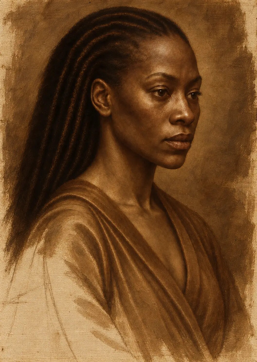
Before the portrait acquired its jewel-like colour, luminous flesh and deep surrounding blacks, it had to work as an arrangement of light and darkness.
In this fourth article accompanying Painting Without Wet Paint, I examine the simulated grisaille and verdaccio underpainting: the stage at which the figure was modelled tonally, illumination was established and the emotional structure of the final painting began to emerge.
Colour is often the first thing we use to describe a painting.
We speak about the warmth of the skin, the depth of a red, the richness of a blue or the brilliance of gold. Colour attracts language because it appears expressive and immediate. It is easy to point towards a particular hue and name what it contributes to the image.
Light is less easily separated.
It moves through everything. It determines which colours are visible, which surfaces advance and which forms disappear into shadow. It shapes the cheek, catches the eye, describes the texture of the fabric and gives a jewel its sudden point of brilliance. It tells us how near or distant an object feels and whether a darkness is deep, empty, warm, cool, reflective or absorbent.
Before colour could be allowed to perform any of these roles in the portrait, the light had to be organised.
The central question at this stage was not simply, “Where should the image be bright?”
It was more exacting:
Where does the light come from? What does it touch first? How does it travel across the face? Which structures turn away from it? What remains visible inside the shadow? Where should an edge dissolve? Which illuminated passage deserves to become the focal point—and which should remain quiet?
These decisions formed the tonal architecture of the work.
Without them, later colour would have decorated the portrait but not given it weight.
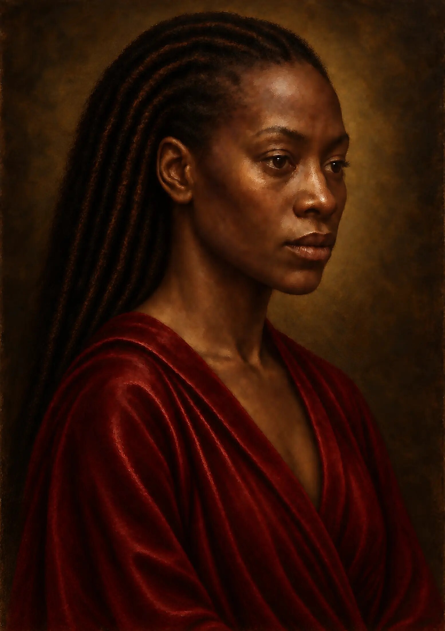
Light is structure
The eye does not understand volume through outline alone.
A drawn contour can tell us where a form ends, but light and shadow tell us how that form turns. The forehead curves away from illumination. The bridge of the nose catches a narrower light. The cheek presents a broader plane before receding towards the ear. The lower lip projects above the shadow beneath it. The jaw moves towards the darkness of the background.
Each transition gives the face three-dimensional meaning.
This is why tonal organisation cannot be reduced to making one side of a portrait light and the other side dark. A face is not a flat object divided into two halves. It contains many planes, each meeting the light at a different angle.
Some surfaces receive direct illumination. Others turn into halftone. Recessed areas enter form shadow. Small amounts of reflected light return from neighbouring surfaces. Occlusion creates darker accents where light has difficulty entering, such as beneath the upper eyelid, inside the nostril or at the meeting of the lips.
The painting becomes convincing when these relationships agree with one another.
A single highlight can be attractive. A complete light structure creates presence.
From drawing into volume
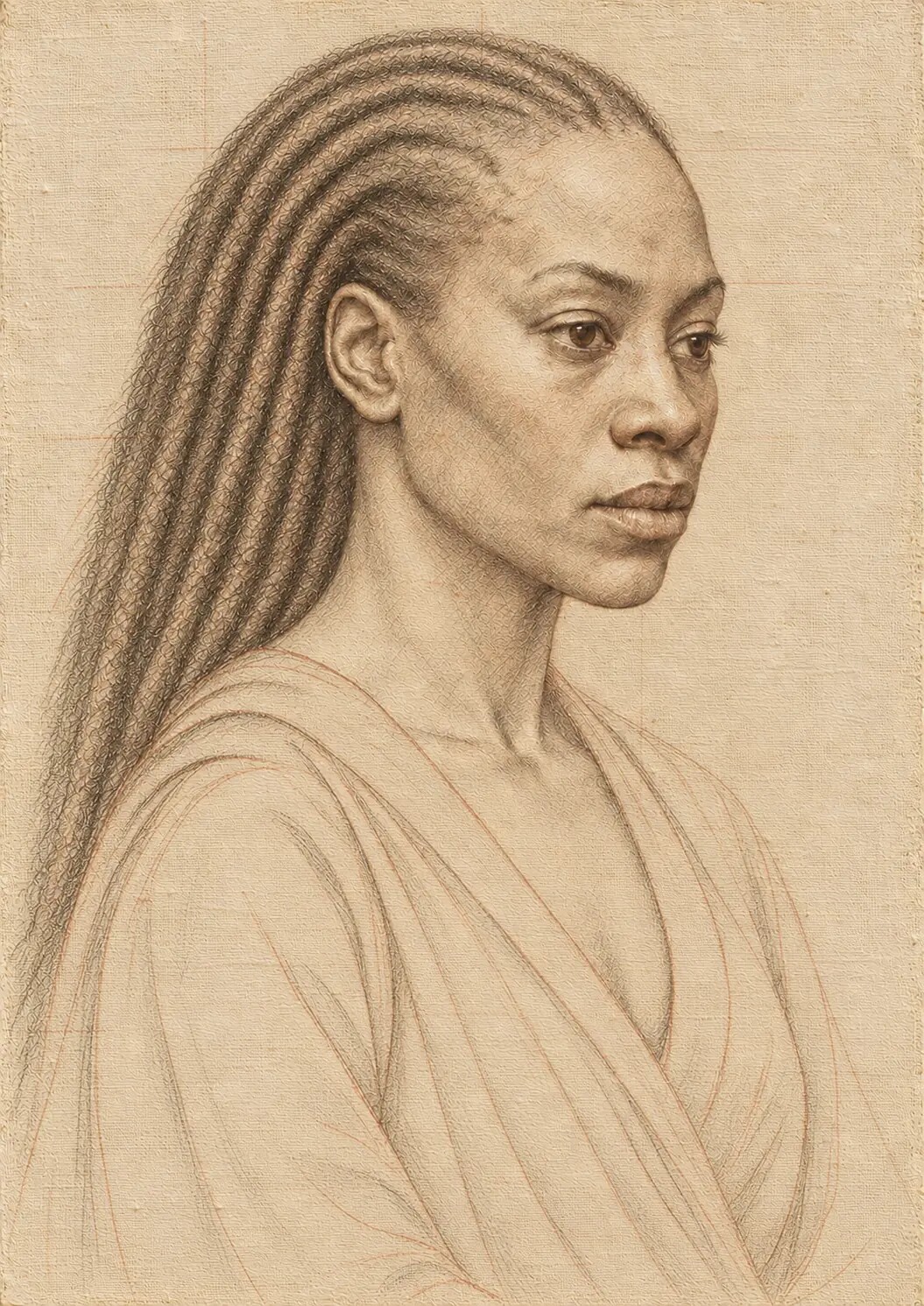
The previous stage, the underdrawing, established the position and proportion of the figure. It located the eyes, nose, mouth, jaw, shoulders and principal garment forms. It also recorded corrections and preserved some evidence of searching.
But drawing alone could not complete the transition from line to body.
The tonal underpainting began by reducing the authority of the outline. Instead of relying on a line around the cheek, the image started to describe the gradual turn from illuminated flesh into shadow. The nose became a projecting form rather than a contour. The eyes entered their sockets. The lips began to sit around the dental arch.
This changed the character of the portrait.
The figure was no longer being held together mainly by boundaries. It was being held together by light.
That distinction was essential because the final image would depend upon lost and found edges. Parts of the face needed to emerge clearly, while other parts moved gently into the surrounding darkness. If the underdrawing had remained equally strong everywhere, the finished portrait would have looked cut out.
The tonal stage allowed the line to become selective.
Some edges remained decisive. Others were absorbed into adjacent values. The form stayed coherent because its internal modelling had become strong enough to carry it.
Grisaille and verdaccio
Two historical terms are especially relevant to this stage: grisaille and verdaccio.
A grisaille is a painting or preparatory image executed in monochrome or within a very limited range of colour. Form is created principally through changes in tone. The National Gallery’s definition of grisaille includes both independent monochrome works and images in which tonal variation is the dominant organising principle.
Verdaccio refers more specifically to a muted greenish or grey-green preparation associated with some Italian painting practices, particularly in the modelling of flesh. A cool or green-biased underlayer can temper the warmth of later flesh colour and create subtle depth in shadows.
These terms should not be treated as interchangeable or as proof that every Renaissance painter followed one fixed recipe. Grisaille could be a finished visual language in its own right. Verdaccio varied in composition and use. Workshops developed different methods, and individual artists altered those methods according to the work.
The underpainting for this portrait was informed by both traditions.
It functioned as a grisaille because tonal relationships were its principal concern. At the same time, selected areas—especially the flesh—contained a restrained green-grey character associated with verdaccio. The result was not a strict reconstruction of one historical formula. It was a digitally simulated tonal system built from several related historical principles.
Its purpose was clear: to establish light before the complexity of colour arrived.
Why green beneath flesh?
The use of a greenish underpainting beneath warm flesh can initially sound counterintuitive.
Why place a cool, muted colour beneath skin that will eventually appear alive, warm and luminous?
The answer lies in relationship.
Flesh is not one uniform peach, pink or brown. It contains warm and cool passages. Blood-rich areas around the lips, nostrils, cheeks and ears may appear warmer. The forehead can be cooler. The shadows around the eyes can carry grey, violet, brown, olive or green tendencies depending upon the sitter, the light and the surrounding colours.
A cool underlayer can help prevent the upper colour from becoming uniformly warm. When thin warmer passages are placed above it, the underpainting modifies them. In selected shadows, the cooler foundation can remain influential, producing depth without requiring the surface colour to become heavy or opaque.
For darker skin, this relationship requires particular care.
A green-grey underpainting cannot simply be copied from a formula designed around a narrow historical idea of flesh. If it is too pale, too cold or too opaque, it can make the skin appear lifeless or ashen. If the later colour is used only to cover that error, the layering process loses its purpose.
The underpainting must respond to the actual tonal range, undertone and reflective behaviour intended for the subject.
In this portrait, the cooler preparation was restrained. It helped organise shadow and neutralise excessive warmth, but it did not become a mask. The later skin colour needed to feel as though it grew through the tonal structure, not as though it had been applied on top to correct it.
Seeing value without being distracted by hue
Colour can conceal tonal weakness.
A red and a blue may appear dramatically different even when they possess similar lightness. A highly saturated colour can attract attention despite contributing little to the volume of the form. Warm colour may seem to advance and cool colour to recede, creating an impression of depth that does not survive when the image is viewed in monochrome.
The tonal underpainting removes these distractions.
When the portrait is reduced to a narrow range of grey, brown or green-grey, the structure becomes easier to judge. The artist can see whether the face is readable, whether the focal area is clear and whether the dark passages retain enough variation to remain alive.
This does not mean that colour is secondary or unimportant.
Colour will later alter the emotional and spatial relationships established by tone. A translucent red glaze can deepen a shadow. A warm highlight can advance. A cool passage can soften or recede. But colour works most powerfully when it enters an image whose basic organisation is already sound.
The tonal stage asks whether the painting can stand before colour gives it its final voice.
Building the hierarchy of values
The portrait’s tonal structure was organised into broad families before small transitions were refined.
At its simplest, the image contained:
- The principal lights.
- The halftones turning away from those lights.
- The main shadows.
- Reflected light within selected shadow passages.
- Dark accents.
- Small, reserved highlights.
These were not equally distributed.
The face carried the most important transitions. The surrounding darkness was simpler and quieter. The clothing supported the figure through larger folds and limited reflected light. Jewellery and ornament were prevented from reaching their final brilliance too soon.
The brightest values were deliberately held back.
If the underpainting had already contained pure, sparkling highlights, the later stages would have had nowhere to go. The final painting needed a hierarchy in which small lights could be added gradually and reserved for places of greatest significance: the eye, a moist lip, a jewel, the edge of fabric or a small plane of illuminated skin.
The tonal underpainting therefore established light without exhausting it.
The light source must be believable
A painted light source does not have to be shown.
We do not need to see the window, candle or opening from which the illumination arrives. But the effects of that source must agree.
In this portrait, the light was designed to enter from one principal direction and to fall across the face with controlled intensity. The nearer planes received the clearest illumination. Forms turning away from the source entered halftone and then shadow. Small areas of reflected light prevented the darker side of the face from becoming empty.
Every highlight had to answer to this structure.
The catchlight in the eye, the sheen on the lower lip, the glint on ornament and the brighter edge of fabric could not each invent a separate source. Their angle, intensity and sharpness had to remain related.
This is an area in which digitally generated imagery often becomes inconsistent. A face may be illuminated from one direction while jewellery reflects another. Both eyes may contain different window shapes. The lips may carry a frontal studio highlight even though the cheek suggests side lighting. Fabric may shine without regard to its folds.
Individually, each effect can look plausible.
Together, they reveal that no unified light was governing the image.
The underpainting provided that governing structure.
Chiaroscuro as more than drama
The Italian term chiaroscuro joins chiaro, meaning light or clear, with scuro, meaning dark. In painting, it refers to the use of tonal contrast to model volume and, often, to create dramatic or emotional effect. The National Gallery notes that chiaroscuro can make figures appear three-dimensional while also shaping the emotional force of a work.
This portrait uses chiaroscuro, but darkness was not introduced merely for theatrical impact.
The darkness performs several functions.
It concentrates attention on the face. It separates small illuminated passages from surrounding quiet. It allows the figure to appear gradually rather than presenting every form with equal clarity. It creates atmosphere around the sitter and slows the viewer’s reading of the image.
Most importantly, it gives the light consequence.
A highlight becomes significant because it has been earned against restraint. If the whole painting were bright, the same highlight would lose its authority.
Chiaroscuro is therefore not simply contrast.
It is the organisation of visibility.
Darkness is not absence
Digital black is easy to produce.
A value can be lowered until no detail remains. The result may appear powerful on an illuminated screen, but it often becomes lifeless in print. Form disappears, subtle colour collapses and the black behaves like an empty hole rather than painted shadow.
The background of this portrait needed to be dark without becoming vacant.
Minute differences in value and temperature were retained. Some areas leaned towards warm brown-black; others towards cooler, more neutral darkness. The simulated ground and linen remained faintly influential beneath thinner passages. Soft transitions prevented the figure from appearing pasted against a flat black field.
The shadowed side of the face required even greater discipline.
It had to remain subordinate to the light while preserving enough structure for the head to feel complete. The eye socket, cheek, jaw and neck could not simply vanish. Nor could they be brightened so much that the chiaroscuro lost its tension.
The solution lay in compressed variation.
The shadows occupied a relatively narrow dark range, but they were not identical. Reflected light recovered selected planes. Deep accents remained in the nostril, between the lips and beneath the eyelid. Other dark passages were softer and more open.
Blackness became articulated.
The difference between form shadow and cast shadow
Not all shadow behaves in the same way.
A form shadow appears where a surface turns away from the light. Its transition may be gradual, especially across curved forms such as the cheek or forehead.
A cast shadow appears when one form blocks light from reaching another. It often has a more definite origin: the nose casts a shadow onto the cheek, the upper lip shades the area beneath it, or a fold of fabric casts darkness across another fold.
Confusing these shadow types can make a face feel structurally uncertain.
If every shadow has a hard edge, the skin appears cut into separate pieces. If every transition is soft, projecting features lose their physical effect. The nose may no longer stand forward. The lips may flatten. The eyelids may cease to wrap around the eye.
During the underpainting, edges were adjusted according to the kind of shadow being described.
Curving form transitions remained broad and gradual. Small occlusion shadows became firmer. Cast shadows were controlled according to the apparent size and distance of the light source. The edge of the nose shadow, for example, could not be sharper than every focal feature around it without becoming distracting.
The character of an edge became part of the light.
Lost and found edges
A Renaissance-inspired portrait does not need every boundary to remain visible.
Some edges are found: they are clear enough to locate a feature decisively. Others are lost: the values on either side become so close that the boundary dissolves.
This variation is one of the most powerful ways to direct attention.
A sharply defined eyelid can draw the viewer towards the gaze. A softened cheek can turn gently into atmosphere. Hair can merge with the background before returning through a selective highlight. One side of the jaw can remain legible while the other disappears.
A lost edge is not a mistake or an unfinished passage.
It is an active decision about how the viewer will discover the form.
This mattered particularly in the relationship between the figure and the surrounding darkness. If the entire silhouette had remained sharp, the portrait would have resembled a cut-out placed over black. If every edge had disappeared, the head would have lost its authority.
The underpainting alternated between definition and dissolution.
The figure emerged through rhythm.
The eyes inside the tonal structure
The eyes needed attention, but not premature spectacle.
At the underpainting stage, their purpose was to sit convincingly within the sockets and to participate in the same light affecting the rest of the face. The whites of the eyes could not be treated as white. They remained muted, curved and partly shadowed by the upper lids.
The nearer portions received slightly more light. The corners softened into surrounding flesh. Dark accents established the pupil, lash line and depth beneath the upper lid, but the final reflective highlights were reserved.
This restraint protected the expression.
Overly bright eyes can detach from a dark portrait and produce an artificial stare. Excessive contrast can make them appear illuminated from within. If every boundary is sharpened, the moisture and curvature of the eye are lost.
The tonal stage established enough contrast for the gaze to function while leaving room for later colour, glaze and tiny points of reflection.
The eyes began to look rather than shine.

Modelling the mouth without colour
The mouth is often understood through colour: red lips against surrounding skin.
Remove that colour and its structure becomes clearer.
The upper lip generally receives less direct light than the fuller lower lip, although the exact relationship depends upon the pose and source. The meeting of the lips creates a compressed dark interval. The area immediately beneath the lower lip often recedes before the chin catches light again.
These value changes give the mouth volume.
In the underpainting, the lips were kept close enough to the surrounding flesh to avoid a pasted-on appearance. The central separation was varied rather than drawn as a hard, continuous black line. The corners softened into the face. A restrained light established the lower lip’s projection without introducing the final moist highlight.
This stage exposed whether the mouth belonged to the head.
If it remained convincing without red colour and gloss, later refinement could enrich it. If it failed tonally, colour would only disguise the problem.

Illuminating dark skin without bleaching it
The lighting of darker skin carries both technical and cultural consequences.
Historically, many photographic, cinematic and digital systems have been calibrated around limited assumptions about whose skin is treated as the default. Poor exposure and colour handling can erase tonal variation in darker complexions, push shadows into undifferentiated black or brighten highlights until the skin appears pale, grey or metallic.
A Renaissance-inspired chiaroscuro portrait can repeat these failures if darkness is confused with disappearance.
The aim in this work was not to lighten the sitter in order to make the face readable. It was to construct a sufficiently precise tonal range within the skin itself.
Dark skin reflects light in complex ways. Broad diffuse reflection reveals the form, undertone and colour of the skin. Smaller specular reflections can appear brighter where the surface catches direct illumination, especially around the eyes, lips and selected high points. Those highlights do not change the sitter’s underlying complexion. They describe the meeting between light and surface.
This distinction had to be preserved.
The illuminated side of the face needed luminosity without bleaching. The shadowed side needed depth without erasure. The transition between them needed enough chromatic and tonal information to keep the skin alive.
Even before full colour, the underpainting could establish this respect. It could keep the principal lights within a believable range, preserve form inside the shadows and avoid treating the brightest possible value as the automatic sign of beauty or importance.
Light was used to reveal the sitter—not to transform her into a different standard.
The face as the source of hierarchy
The brightest part of a painting is not always the most important, but brightness strongly attracts attention.
Every light therefore had to be judged in relation to the face.
Jewellery could contain sharp reflections, but those reflections had to remain small. The jacket could catch broader highlights, but their contrast could not overwhelm the eyes. Hair could carry selected glints without turning into a field of bright strands.
This hierarchy was built into the underpainting before precious colours arrived.
The face received the richest range of halftones and the most carefully controlled transitions. Secondary materials were simplified into larger masses. Background variation remained quiet. Ornament was treated as support.
When colour was later added, this tonal order prevented saturated fabric, metallic details and gemstones from taking control of the image.
The sitter remained the centre of gravity.
Light describing different materials
The same illumination behaves differently on skin, velvet, satin, metal, hair and stone.
Skin usually presents broad transitions interrupted by smaller moist or oily reflections. Velvet absorbs much of the light, producing deep colour with relatively soft highlights. Satin generates more directional and sometimes sharper bands. Polished metal can move rapidly between darkness and intense reflection. Hair is first read as a mass, with selected strands or groups catching light according to direction and surface.
The tonal underpainting could not yet describe the complete colour of these materials, but it needed to establish their different reflective patterns.
If every material shared the same highlight width and softness, the final colour would struggle to separate them. Gold would resemble yellow fabric. Pearl would resemble pale skin. Hair would look like wire.
Material differentiation begins in value.
The underpainting established broad, soft changes across flesh; deeper absorption in selected fabric; sharper accents in ornament; and directional rhythms in the hair. Later colour and surface texture would extend these distinctions rather than invent them from nothing.
Reflected light: enough to reveal, not enough to compete
Shadow is rarely illuminated only by the principal source.
Light bounces from nearby surfaces and returns into areas that would otherwise be dark. Clothing can send colour into the jaw. Skin can reflect warmth beneath the chin. A pale surface outside the frame can lift the shadowed side of the face.
Reflected light helps preserve volume because it distinguishes the shadow side of a form from the background behind it.
But reflected light is easy to overstate.
If it becomes as bright as the directly illuminated planes, the form loses its orientation. The viewer no longer knows which light is primary. The portrait can acquire a glossy, computer-rendered appearance in which every surface edge has been artificially recovered.
The reflected light in this image was therefore kept subordinate.
It revealed the turn of the cheek, the presence of the jaw and selected folds in the garment. It did not eliminate the mystery of the shadow. It allowed the viewer to sense form without receiving all the information at once.
Restraint preserved depth.
Ambient shadow and the space around the sitter
The figure does not exist independently of the atmosphere.
Even a dark background influences the edges and perceived temperature of the face. A warm darkness can make a cooler skin passage appear more pronounced. A cool background can intensify warmth. Similar values can dissolve boundaries; contrasting values can sharpen them.
The surrounding space was therefore considered as part of the tonal design.
It was not filled after the portrait had been completed. Its value range developed alongside the figure. Selected areas behind the head became fractionally lighter or warmer to preserve the silhouette. Other areas deepened so that the illuminated face could advance.
This created an atmosphere rather than a backdrop.
The darkness seemed to extend around the figure, not merely behind it.
Avoiding theatrical spotlighting
Dramatic lighting can become a shortcut.
A very bright face against absolute black immediately resembles certain historical portraits in a general sense. But if the light has no gradual effect, the result can feel staged rather than painted. The face appears illuminated by a modern theatrical spotlight while the rest of the body has been digitally removed.
The tonal underpainting resisted this by building intermediate values.
Light reached the face most strongly, but it also touched the neck, garment and selected ornament. The background retained slight variation. The transition into darkness occurred through several stages rather than one abrupt cut.
The result could still be dramatic.
Drama became more persuasive because it was supported by spatial logic.
The emotional direction of light
Light is never only technical.
A frontal, even illumination can suggest openness, clarity or confrontation. Light from above can create gravity, ceremony or spiritual association. Side lighting can produce introspection, tension or psychological division. Light rising from below can appear theatrical or unsettling.
These meanings are not fixed, but viewers bring visual experience to them.
For this portrait, the chosen light needed to create authority without spectacle and mystery without turning the sitter into an unknowable symbol. It needed to reveal enough of the face for the gaze to remain direct while allowing the surrounding darkness to slow the encounter.
The sitter was not emerging from darkness as though gaining permission to become visible.
She was already present.
The darkness functioned as a field of concentration around that presence. The light did not rescue the figure. It recognised and articulated her.
That difference shaped the emotional tone of the work.
Testing the tonal map
The portrait was repeatedly reduced and simplified to test its tonal organisation.
At thumbnail scale, small details disappeared. What remained was the relationship between the illuminated face, the body and the surrounding dark field. If the composition failed at that scale, more detail would not repair it.
In greyscale, colour could no longer carry attention. This exposed any saturated passage that had appeared important without possessing sufficient tonal difference.
Blurred viewing suppressed edges and texture. It revealed whether the major light and dark masses remained coherent.
High magnification served a different purpose. It allowed individual transitions around the eyes, lips, nostrils and jaw to be checked for abrupt digital steps, false halos and inconsistent highlights.
Each test asked a different question.
The portrait needed to function as a pattern from across a room and as a constructed surface at close range.
Correcting digital smoothness
Digital tonal gradients can become unnaturally smooth.
A perfectly continuous transition may initially appear refined, but it can make flesh look airbrushed or plastic. Physical paint usually contains subtle interruptions: brush direction, underlying tooth, pigment variation and small changes in opacity.
The answer was not to add random noise.
Noise does not automatically become paint.
Instead, transitions were broken selectively. Small changes followed the form of the face. Cooler and warmer tendencies were anticipated even within the limited palette. The simulated ground and brushwork remained faintly active beneath the modelling.
The forehead could remain smoother because its broad plane required calm. The cheek allowed slightly more variation. The mouth and eyes contained firmer changes where anatomy demanded them. Shadow transitions remained soft without becoming mechanically blurred.
The surface began to feel worked rather than processed.
Correcting false sharpness
The opposite problem also appeared.
AI-assisted and digitally enhanced images often contain excessive local sharpness. Every eyelash, wrinkle, fold and highlight may be rendered with equal force. The result can look detailed while losing depth.
Sharpness brings an edge forward.
If every edge advances, the image flattens.
During the tonal stage, secondary edges were softened. Hair disappeared into the background. Some garment folds were reduced. The boundary of the shadowed cheek became quieter. The strongest definition was reserved for the focal features.
This did not reduce realism.
It increased spatial order.
Correcting featureless black
Deep shadow was examined at increased screen brightness and through adjusted proof views to determine whether information had been lost.
This was not an instruction to brighten all the blacks. The painting required genuine darkness. But the dark passages needed internal distinction so that they would not collapse during printing.
The deepest accents were separated from the broader background shadow. The shadowed side of the face retained narrow but meaningful variation. The clothing remained distinguishable from the surrounding field in selected areas.
These differences might be barely visible on the screen at normal brightness.
In print, they could determine whether the portrait retained depth or became blocked.
The screen is not the print
A screen emits light. A fine-art print reflects the light falling upon it.
This difference affects the entire tonal architecture.
On a bright display, deep shadows can appear luminous and separated because the screen is actively producing light even in low values. On textured paper, dark ink interacts with the paper’s absorbency, surface tooth and white point. Subtle shadow differences may become compressed.
Hahnemühle German Etching, the intended paper for this A3 interpretation, has a substantial textured surface and a warm, tactile character. That surface can strengthen the relationship between the image and its simulated painting materials. It can also soften extremely fine detail and reduce the apparent depth of the darkest blacks compared with a glossier photographic paper.
The tonal master therefore needs proofing.
Critical crops should include the shadowed side of the face, the eyes, lips, hair, jacket and deepest background. The question is not simply whether the print matches the screen. It is whether the translated image preserves the intended hierarchy.
A print may require carefully controlled adjustments to shadow separation, local contrast and sharpening. These adjustments should serve the chosen paper rather than globally brightening the work.
Print preparation is another stage of painting with light—except that the light now belongs to the room.
AI and the judgement of light
AI can generate dramatic lighting rapidly.
It can propose chiaroscuro, illuminated faces, dark backgrounds and convincing local reflections. It can also produce contradictions with equal confidence.
The artist must determine whether the light has a source, whether it respects the anatomy and whether it serves the meaning of the portrait.
This required a repeated cycle:
- Define the lighting problem.
- Generate or reconstruct a tonal passage.
- Inspect it at full-image and close-detail scales.
- Compare the feature with the facial structure and principal light direction.
- Identify blocked shadows, false highlights or inconsistent reflections.
- Refine or rebuild the passage.
- Reassess the complete tonal hierarchy.
- Accept the change only if it strengthens the whole image.
The technology could produce possibilities.
It could not decide which possibility carried the right emotional weight.
When more contrast makes the painting weaker
Contrast is seductive.
Darkening the background and brightening the face can make an image appear more powerful immediately. Social-media thumbnails reward this clarity. The portrait becomes easier to recognise on a small screen.
But repeated contrast enhancement can destroy the relationships that make chiaroscuro convincing.
Halftones disappear. Skin begins to look metallic. Highlights clip to empty white. Shadows lose their internal colour. The transition from figure to background becomes abrupt. Every dramatic decision competes with every other.
The tonal underpainting established limits.
The brightest values were reserved. The deepest blacks were used selectively. Much of the face existed between those extremes. That middle range gave the skin volume and allowed later transparent colour to work.
Power came from control, not from pushing every value to its limit.
Light and the time of looking
A brightly and evenly illuminated image can be understood quickly.
A chiaroscuro image behaves differently. It reveals itself over time. The viewer first encounters the principal light, then begins to notice quieter forms within the shadow. An edge that seemed lost becomes perceptible. A piece of ornament appears. The garment separates from the background. The dark side of the face gains structure.
This delayed recognition was part of the artistic intention.
The portrait was not designed to surrender every detail at once. Its darkness asks the viewer to remain.
That invitation carries particular importance in a culture of rapid image consumption. The work uses the language of historical painting not only to resemble another period but to create a different pace of attention.
Light becomes a way of regulating time.
Visibility, power and the right to opacity
There is a cultural tension in any discussion of visibility.
To be visible can mean to be recognised, valued and admitted into public memory. It can also mean to be examined, categorised and made completely available to the viewer.
The portrait needed to hold both possibilities.
The sitter is unquestionably present. Her face receives the principal light. Her gaze is not hidden. She occupies the visual language of permanence and authority.
Yet the darkness preserves something that is not fully surrendered.
Not every part of the figure is equally available. The surrounding shadow creates dignity and distance. The viewer is invited into an encounter but is not given unrestricted possession of the subject.
Chiaroscuro therefore becomes more than modelling.
It negotiates between recognition and privacy, revelation and opacity.
The tonal stage as artistic restraint
The underpainting was not designed to look finished.
Its colour remained limited. Its highlights were incomplete. Its surfaces lacked the final distinctions of glaze, scumble and varnish.
That incompleteness was useful.
It allowed the portrait to be judged without the seduction of finish. If the face did not hold together tonally, no later layer could be trusted to solve it. If the hierarchy was unclear, jewellery and pigment would only make the confusion more expensive.
The tonal stage imposed restraint on the process.
It asked the painting to earn its colour.
What the underpainting contributed to later colour
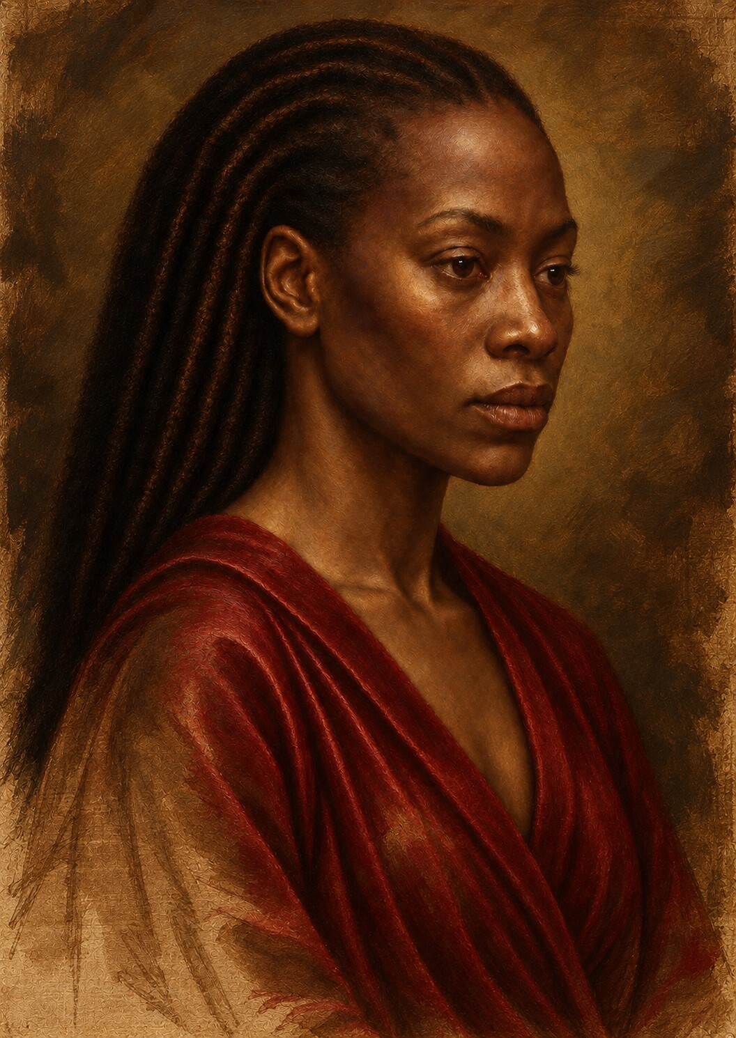
When the dead-colour and glazing stages were introduced, the tonal underpainting continued to influence them.
Warm flesh passages were placed over a cooler structure. Thin colour allowed parts of the underpainting to remain optically active. Opaque lights covered it more fully. Transparent shadows deepened the existing form without replacing it.
The jacket inherited its large folds from the tonal stage. Jewellery acquired colour above already established contrasts. Hair received selective warmth and reflected light without losing its organisation as a dark mass.
Colour did not have to invent volume.
It entered a world in which volume already existed.
What the finished portrait remembers
In the completed artwork, the grisaille and verdaccio stage is no longer visible as a separate image.
The flesh now contains colour. The lips carry translucent red. The clothing has depth and material identity. Small highlights animate the eyes and ornament. Glazes enrich the shadow, while scumbling softens selected lights.
Yet the tonal architecture remains active beneath everything.
It can be felt in the turn of the cheek, the projection of the mouth, the recession of the eye socket and the relationship between the figure and the surrounding darkness. It determines which colour appears luminous and which remains quiet. It allows the smallest highlight to matter.
The final light is not an effect placed over the portrait.
It is the visible result of decisions made before colour arrived.
The image in the dark
A painting can contain many colours and still feel flat.
It can contain only a few tones and feel monumental.
The difference lies in the organisation of light.
For this portrait, the tonal underpainting became the stage at which appearance turned into presence. The drawing had established where the figure was. Light established how the figure occupied space, how the face met the viewer and how much of the image would remain withheld.
The process required more than brightness and contrast.
It required a hierarchy of values, a consistent source, distinctions between kinds of shadow, respect for the reflective character of darker skin, control of edges and enough variation inside the blacks to prevent darkness from becoming empty.
Most of this work would eventually be covered.
That was its purpose.
The tonal structure did not need to compete with the final colour. It needed to carry it.
When the later glazes deepened the skin, when the red of the lips became translucent and when the smallest light entered the eye, those effects acquired authority because the painting already understood where light belonged.
Colour made the portrait richer.
Light had already made it real.
ARTWORK AND PROCESS STATEMENT
The pigment was simulated. The discipline of light remained exacting.
Painting Without Wet Paint is a digitally constructed, AI-assisted artwork developed under sustained artistic direction. Its tonal underpainting was digitally simulated through a limited grey, brown and green-grey range informed by grisaille and verdaccio traditions.
No physical grisaille, verdaccio pigment or oil-bound underpainting was applied to linen. The stage reconstructs the visual and structural functions of tonal underpainting: modelling form, organising chiaroscuro, controlling focal hierarchy, preserving detail in shadow and preparing the image for later opaque and translucent colour.
FURTHER READING
The historical language of light and preparation
Technical definitions from the National Gallery clarify chiaroscuro, grisaille, underdrawing, ground and raking light—the vocabulary behind this contemporary tonal reconstruction.