ARTICLE NINE · PRINT TRANSLATION
From Pixel to Presence
How colour management, enlargement, proofing, paper selection and physical presentation transform a luminous digital master into a convincing fine-art print.
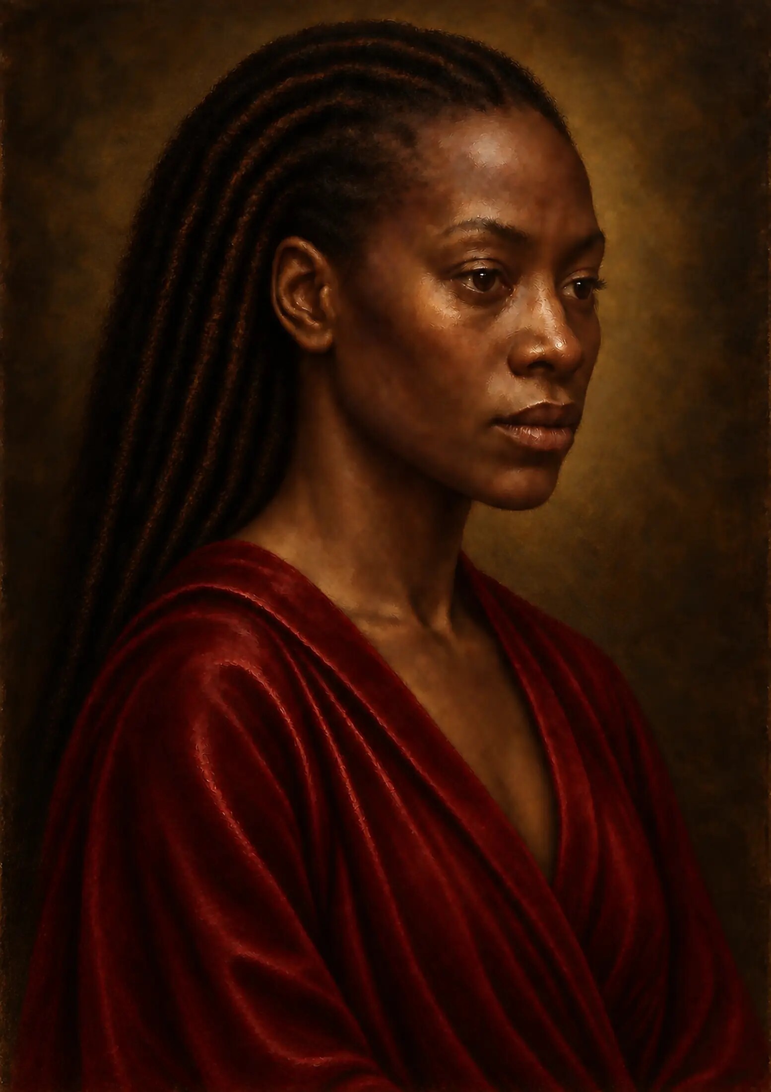
A finished image on a screen is not yet a finished physical artwork.
Article Nine follows the portrait beyond its completed digital surface and into calibration, proofing, Hahnemühle German Etching, Fuji Pearl, framing and gallery light.
A finished image on a screen is not yet a finished physical artwork.
The digital master may contain all the colour, detail, tonal subtlety and surface illusion that the artist intended, but those qualities do not pass automatically into paper. A screen emits light. A print reflects it. A display can deepen a black by reducing illumination and intensify a colour by increasing brightness. Paper must work with the light that reaches it, the ink it can hold, the white of its own surface and the conditions in which it will be viewed.
In this ninth article accompanying Painting Without Wet Paint, I examine the stage at which the portrait leaves the controlled flexibility of the digital studio and begins its transformation into an A3 fine-art object. The questions are no longer only about the image. They are about calibration, resolution, enlargement, colour space, proofing, paper, black density, skin tone, sharpening, borders, glazing, framing and light.
The file is not simply reproduced. It is translated.
The Screen Is Not a Neutral Window
Digital artwork is frequently judged on devices that were never designed to function as calibrated proofing environments.
A phone may increase saturation and contrast. A tablet may adapt its white balance to the room. A laptop may be too bright, too cool or positioned at an angle that changes the apparent depth of the shadows. Two people looking at the same file on different displays may therefore be looking at meaningfully different versions of the work.
This matters especially for a portrait built around restrained tonal relationships. The illuminated face depends upon small distinctions between reflected light, halftone and shadow. The surrounding darkness depends upon separation between several near-black values. The garment contains crimson passages that must feel deep without collapsing into a single red mass. Jewellery and highlights must remain brilliant without becoming clipped or synthetic.
The first stage of print preparation was therefore perceptual rather than mechanical: the screen had to be treated as an instrument requiring control.
Brightness was reduced to a realistic working level. Neutral greys were checked for colour cast. The darkest passages were examined without allowing the display to make them appear more open than paper could reproduce. The image was viewed at different scales and at different times of day, but the calibrated display remained the reference rather than whichever device made the work appear most dramatic.
Calibration Before Correction
Monitor calibration helps establish a more reliable relationship between the digital file and its physical output.
Calibration does not make a screen identical to paper. That is impossible because one emits light and the other reflects it. It does, however, reduce avoidable uncertainty. It establishes a known white point, luminance, gamma and colour response so that corrections are made in relation to a stable reference.
Without calibration, an artist may compensate for the behaviour of the screen rather than improve the file. An overly bright display encourages prints that are too dark. A cool display can lead to unnecessary warming. Excessive screen contrast may cause the artist to open shadows that would otherwise print with sufficient structure. Each correction appears reasonable on the uncorrected device while moving the master further away from dependable output.
The aim was not to force a perfect match. It was to make the differences predictable enough to judge.
Preserving the Master File
The print file should never become the only surviving version of the artwork.
The digital master preserves the broadest tonal range, the highest practical resolution, the full working colour information and the possibility of producing future interpretations. It should remain untouched by paper-specific adjustments, output sharpening or cropping decisions made for one edition.
A separate derivative was therefore created for the intended A3 print. This file could be resized, converted, sharpened and adjusted for a particular production path without permanently narrowing the original artwork.
The distinction is important.
The master preserves possibility. The print derivative records a decision.
That decision includes the intended dimensions, the ratio of image to paper, any border, the print process, the paper profile and the specific refinements needed for the first proof. If another edition is later produced on a different surface, a new derivative should be made from the master rather than from the already altered A3 file.
Resolution Is More Than a Number
Print resolution is often discussed as though a single number guarantees quality.
Pixels per inch are important, but the usefulness of those pixels depends upon what they contain. Clean tonal transitions, coherent edges and meaningful texture can survive enlargement more successfully than a file filled with brittle micro-detail, repeated noise or artificial sharpness. A high numerical resolution cannot rescue weak structure. A lower resolution file may still print convincingly when its information is well organised and the viewing distance is appropriate.
For the A3 edition, the portrait was assessed at the exact intended dimensions rather than through abstract enlargement percentages. The key questions were practical:
- Does the face retain anatomical coherence at print size?
- Do the eyes remain alive without becoming over-sharpened?
- Does the mouth keep its soft asymmetry?
- Does the transition from skin to shadow remain gradual?
- Does the garment contain form beneath its colour?
- Do the darkest areas separate from one another?
- Does the simulated surface remain convincing rather than repetitive?
Resolution had to serve these relationships.
Viewing the Image at Print Size
A common mistake is to judge a large print entirely through extreme on-screen magnification.
At 200 or 400 per cent, every pixel transition can appear important. Small irregularities become enormous. Texture that will be quiet at A3 can seem aggressive. Conversely, false detail may look impressive because it occupies the screen while contributing nothing at the final viewing distance.
The image therefore had to be inspected in two complementary ways.
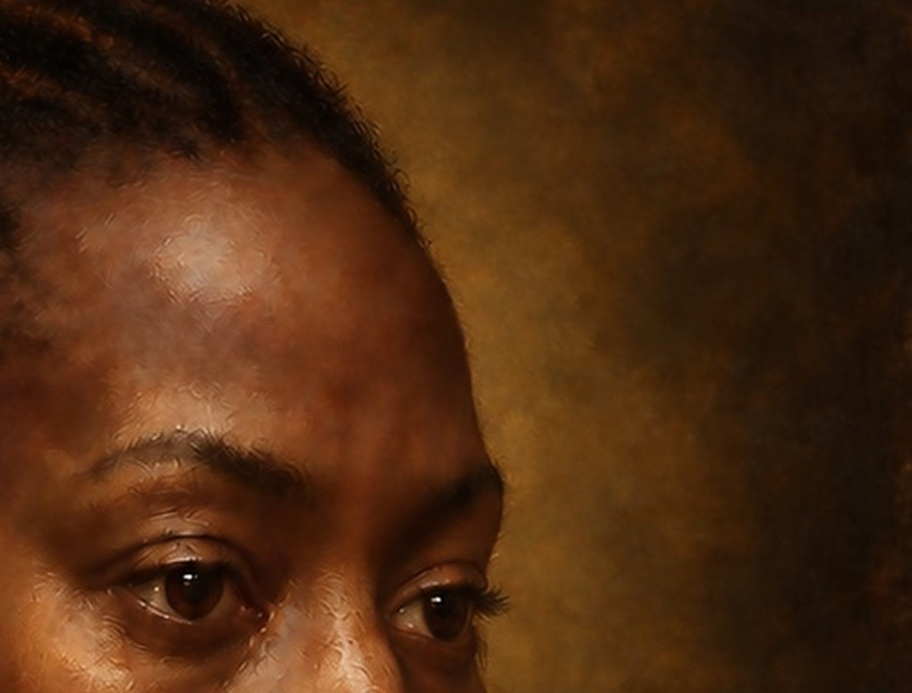
At actual print size, the overall presence of the face, the balance of the composition and the hierarchy of detail could be judged. At close magnification, artefacts, repeated patterns, halos, broken edges and unnatural transitions could be identified. Neither view was sufficient alone.
The macro inspection asked whether the file would survive proximity. The print-size inspection asked whether it would still function as a painting.
Enlargement Cannot Invent Understanding
Modern enlargement tools can create additional pixels and apparent sharpness with remarkable fluency.
They cannot decide which details carry meaning.
Enlargement does not merely reveal detail. It enlarges every defect contained within that detail. A slightly confused eyelid can become structurally wrong. A repeated pore pattern can become a visible texture stamp. A halo around the jaw can become a luminous cut-out. A small inconsistency in the garment can become a break in the logic of the fold.
The enlargement stage was therefore followed by artistic inspection rather than treated as a final technical operation. The eyes, lips, skin, braids, jewellery, jacket and shadow transitions were reviewed individually. False edges were softened. Repeated surface marks were broken. Detail that competed with the face was restrained. Areas intended to remain quiet were not forced into equal sharpness.


Sharpening for the Object, Not the Screen
Sharpening increases local contrast around edges.
Used carefully, it can help detail remain legible after ink spreads into paper. Used aggressively, it can create halos, brittle eyelashes, metallic skin and exaggerated surface noise. The correct amount depends upon the print size, process, paper and viewing distance.
The portrait did not require uniform sharpening. The catchlight, the upper eyelid, selected jewellery edges and some garment details could tolerate greater definition. The cheek, jaw transition, lower lip and passages of scumbling needed restraint. The background required almost none.
Sharpening was therefore understood as part of the final hierarchy of attention. It did not simply make the file clearer. It decided where clarity would be allowed to remain.
Checking the Tonal Range
The portrait’s tonal range carried much of its emotional authority.
The face emerges from darkness rather than sitting in front of it. The crimson garment gains weight from the values surrounding it. Small points of reflected light feel luminous because the larger field remains restrained. If the shadows close too far, the figure loses structure. If they are opened excessively, the atmosphere becomes thin.
A tonal review checked highlight and shadow clipping, but numerical warnings were only the beginning. The image also needed visual separation between the deepest background, the hair, the far side of the face, the jacket and the lower folds of fabric.
The black needed articulation, not apology.
The aim was not to make every dark passage easily visible. Some areas were intended to approach disappearance. The aim was to prevent distinct forms from collapsing accidentally into one undifferentiated mass.
Deep Black Is Not Empty Black
A successful dark print is not simply one that uses the maximum available black.
Black can behave as colour, atmosphere, spatial depth and material presence. In this portrait it surrounds the sitter, receives the edge of the hair and allows the face and garment to emerge gradually. If reproduced as an empty digital void, it weakens the illusion of a painted field. If lifted too far, it loses gravity.
Small shadow-density proofs are particularly valuable because they show how the chosen surface carries near-black distinctions. A matte textured paper may soften them. A photographic surface may hold greater apparent density but reveal reflections. Neither behaviour is automatically better. Each changes the emotional temperature of the image.
Protecting Luminous Flesh
Skin changes noticeably between screen and print.
On a backlit display, colour appears to glow from within. On paper, the light must travel towards the surface, interact with ink and fibre, and return to the viewer. Delicate warm and cool shifts can become quieter. Midtones may feel heavier. Highlights may inherit the colour of the paper.
The print could not be allowed to simplify her presence.
The face was therefore checked for tonal modelling before colour intensity. The forehead, cheek, eyelid, nose, lips and jaw had to remain connected as one form. Warm passages could not be allowed to turn orange; cooler transitions could not become grey or lifeless. The deepest facial shadows needed colour within them, even where that colour was restrained.
A skin-tone proof should include the eye, cheek, nose, mouth and adjacent shadow in one crop. Testing isolated patches would miss the relationships that make the face coherent.

Colour Space and the Limits of Print
A digital master may contain colours that a particular printer-and-paper combination cannot reproduce exactly.
This does not mean that the print has failed. It means that colour must be translated into the available gamut. The important question is which relationships should be protected when literal equivalence is impossible.
For this portrait, the priority was not maximum saturation. It was the relationship between luminous skin, deep crimson, restrained gold, near-black space and the pale points of reflected light. A technically vivid red would be wrong if it separated from the garment’s material weight. A brilliant gold would be wrong if it became a flat yellow accent.
Colour management helps make those compromises visible before the final print is ordered.
Soft Proofing as a Prediction
A soft proof is an on-screen simulation of how a file may appear through a specific printer and paper profile.
It can reveal likely changes in saturation, black depth, paper white and tonal separation. It cannot reproduce the actual texture, reflectivity or physical presence of the surface, but it can help identify where the image is likely to move.
The soft proof should not be treated as a command to restore every apparent loss. Some changes belong to the medium. The purpose is to distinguish acceptable translation from unwanted collapse.
Paper-specific adjustments should be made in the derivative file while viewing the appropriate profile, then confirmed through a physical proof. The profile predicts. The proof decides.
Giclée and the Painterly Object
Giclée printing uses high-resolution inkjet technology to place pigment-based inks on fine-art papers.
For a portrait constructed through the visual language of prepared ground, underpainting, glaze, scumble and varied paint surface, Giclée offers a strong material relationship. A textured matte paper can give the image a sense of weight and tactility without pretending that the work is physically oil-painted.
The process also suits the intended presentation as a contemporary fine-art print. It supports controlled colour, subtle tonal transition and a paper-based object that can be handled, mounted and framed within established conservation practices.
The choice of paper, however, remains as important as the name of the process.
Hahnemühle German Etching
The intended first interpretation of the portrait is an A3 print on Hahnemühle German Etching.
German Etching is a heavyweight 310 gsm fine-art paper with a warm white base and a clearly felt surface. Its texture can support the portrait’s painterly construction, deepen the sense of an object and allow the simulated material history to meet a real material surface.
The slight warmth of the paper may contribute to the skin and the historical atmosphere of the work. Its weight can give the print authority in the hand. Its texture may help the crimson garment, dark field and broken highlights feel integrated rather than clinically smooth.
For these reasons, German Etching offers the strongest initial connection with the painting’s layered and tactile construction.
The Risk of Competing Textures
The artwork already contains visual texture.
The linen weave, broken brushwork, glazing, scumbling, small abrasions and restrained ageing have been constructed within the image. A strongly textured paper adds a second surface. If the two scales support one another, the result can feel materially convincing. If they compete, the portrait can become over-described.
A prestigious surface can still be the wrong surface for an artwork.
German Etching therefore needs to be judged through physical proofing, particularly across the face. The paper texture should not interrupt the eye, break the mouth or make the skin appear uniformly rough. The areas of greatest psychological importance must remain controlled.
C-Type and the Luminous Image
C-type printing offers a different interpretation of the portrait.
Rather than placing pigment ink on fine-art paper, a digital C-type print uses light to expose light-sensitive photographic material. The resulting surface can produce smooth tonal transitions, strong apparent colour depth and a luminous relationship to the digital master.
This process may emphasise the portrait as a contemporary photographic object carrying historical imagery. It can preserve the smoothness of the skin, the clarity of the jewellery and the brilliance of the crimson. It may also hold deep blacks with a different kind of density from a matte paper.
That luminosity is attractive, but it changes the work’s material reading. The portrait may feel less like a paper object informed by painting and more like a highly resolved image-object informed by photography.
Fuji Pearl and Reflective Tension
Fuji Pearl is an especially intriguing alternative because of its reflective, metallic quality.
Its pearl-like response can animate highlights and create a sense of light moving across the surface. Jewellery, eyes, crimson and small accents may gain brilliance. The work can appear to change as the viewer moves, giving the historical portrait a distinctly contemporary physical presence.
The same reflectivity also introduces risk. Highlights can become too emphatic. The face may appear more polished than painted. Reflections from the room may compete with the sitter’s gaze. The surface can shift the work towards spectacle if it is not carefully controlled.
Fuji Pearl should therefore be treated as a materially different interpretation, not as a brighter version of the same print.
German Etching and Fuji Pearl as Two Interpretations
The two surfaces need not be treated as though one is universally superior.
For the intended A3 edition, German Etching offers the strongest initial connection with the painting’s layered and tactile construction.
Fuji Pearl remains a compelling alternative proof—not as a substitute, but as another reading of the image.
One treats the portrait as a contemporary fine-art print informed by the physical memory of painting.
The other treats it as a luminous contemporary object carrying historical imagery through a photographic surface.
Both are legitimate. They say different things.
Paper White Is Part of the Colour
Paper is not an empty support.
Its base colour influences every part of the print, particularly highlights and lightly inked areas. A warmer paper can soften the image and contribute to historical atmosphere. A bright neutral paper can preserve cleaner colour separation and stronger apparent contrast.
The brightest point in a print cannot exceed the light reflected by the paper itself.
This means that paper white functions as part of the palette.
For the portrait, the choice affected:
- the warmth of the skin;
- the neutrality of the eyes;
- the apparent colour of pale highlights;
- the distinction between warm and cool passages;
- the brilliance of jewellery;
- the relationship between age and luminosity.
The Critical-Detail Proof
A full-size test crop is more useful than a reduced reproduction when judging fine detail.
The crop should be printed at the exact scale intended for the final A3 edition. It should include the eyes, lips, skin, garment, jewellery and darkest shadow. This makes it possible to judge edge behaviour, texture, ink spread, tonal separation and the relationship between simulated and physical surface.
A second proof can then target the most uncertain passage—often the transition between illuminated skin and deep shadow. The goal is not to perfect isolated fragments forever. It is to gather enough evidence to approve the complete object.
A Disciplined Proofing Sequence
The proofing process can be organised as a sequence rather than a single expensive final print.
First, a reduced complete image establishes overall brightness, colour balance and composition. Second, full-size critical-detail crops test eyes, lips, skin, jacket and shadow density. Third, a paper comparison examines German Etching beside Fuji Pearl. Fourth, corrections are made only where the evidence shows a real problem. Finally, the complete A3 proof is ordered.
Each proof should answer a defined question. Otherwise the process becomes an accumulation of impressions rather than a record of decisions.
Evaluating the Full A3 Print
The first complete A3 proof introduces questions that cropped tests cannot answer.
Print size is not merely a purchasing option. It determines the physical scale of the painting’s illusion.
At A3, the face, garment and surrounding darkness establish a bodily relationship with the viewer. The image must be judged from across the room, at conversational distance and at close inspection. The border must feel intentional. The paper must carry the image without overpowering it. The darkest areas must remain coherent under ordinary light rather than only beneath ideal studio illumination.
The proof should be lived with for several days. Rapid correction can mistake unfamiliarity for failure.
Framing Changes the Artwork
A print does not end at the edge of the paper.
Mounting, border, frame depth, frame colour and the relationship between image and wall all alter its authority. An antique-gold frame may connect the portrait to historical display, but it must not turn the work into costume. A restrained dark frame may support the contemporary object, but it may also reduce the warmth carried by the image.
The frame should intensify the logic already present: historical memory held within a contemporary artwork.
The Question of Glazing
Glazing protects a work on paper, but it also introduces another reflective layer.
Museum or low-reflection glazing can reduce distraction while providing protection from handling, dust and environmental change. Standard glazing may produce reflections that interfere with the sitter’s gaze and dark passages. The choice affects both preservation and encounter.
Any glazing should be tested with the actual frame and lighting. A specification that sounds ideal may behave differently in the room where the work is shown.
Lighting the Physical Work
The light used to display the print will change it repeatedly.
Warm light may deepen the historical atmosphere and soften the paper white. Cool light may clarify colour separation but reduce warmth in the skin. Strong directional light can reveal paper texture; broad soft light can suppress it. Reflections can animate Fuji Pearl or make it difficult to view.
The final approval should therefore consider the intended gallery conditions, not only the controlled light of the proofing area.
Presence Cannot Be Exported Automatically
Software can export a file. It cannot export presence.
Presence emerges through a chain of judgements: how large the figure becomes, how the shadows hold, how paper receives light, how close the viewer can approach, how the frame establishes distance and how the object occupies the room.
The technical workflow matters because it protects these artistic decisions. Calibration, profiles, resolution and sharpening are not separate from meaning. They are the means by which meaning survives translation.
The Artwork Enters the Room
On screen, the portrait can be enlarged, reduced, brightened and carried between devices.
As a print, it acquires one scale, one surface, one edge and one relationship to light. It can cast a shadow. It can gather dust. It can be approached and left behind. It can occupy a wall long after the screen has gone dark.
That change is not the final administrative stage of the work. It is another act of making.
From pixel to presence, the portrait becomes accountable to the physical world.
A3 Print-Preparation Checklist
Archival master
- Preserve the highest-quality original master.
- Retain the broadest practical colour information and resolution.
- Keep paper-specific adjustments out of the master.
- Store verified backups separately.
Print derivative
- Create a separate file for the intended A3 output.
- Confirm final dimensions, orientation, crop and borders.
- Resize once from the archival master.
- Apply output sharpening only to the derivative.
Tonal review
- Check highlight and shadow clipping.
- Inspect separation between background, hair, face and garment.
- Review the face at print size and close magnification.
- Confirm that deep black retains intentional structure.
Colour review
- Work on a calibrated monitor.
- Use the correct printer-and-paper profile where available.
- Check skin, crimson, gold and near-black relationships.
- Preserve paper-specific corrections separately.
Proofing
- Order a small complete-image proof.
- Print full-size crops of the eyes, lips, skin, garment and shadows.
- Compare Hahnemühle German Etching with Fuji Pearl.
- Record every change and the evidence supporting it.
- Approve a complete A3 proof before edition production.
Presentation
- Confirm paper borders and mounting method.
- Test the proposed frame and glazing.
- Review the print under likely display lighting.
- Inspect the final object at distance and close range.
SELECTED LINES
The image becomes accountable to matter
A finished image on a screen is not yet a finished physical artwork.
The first stage of print preparation was perceptual rather than mechanical: the screen had to be treated as an instrument requiring control.
The master preserves possibility. The print derivative records a decision.
Enlargement does not merely reveal detail. It enlarges every defect contained within that detail.
The black needed articulation, not apology.
The print could not be allowed to simplify her presence.
A prestigious surface can still be the wrong surface for an artwork.
Print size is not merely a purchasing option. It determines the physical scale of the painting’s illusion.
The file is not simply reproduced. It is translated.
SUGGESTED IMAGE SEQUENCE
A visual record of translation, proofing and physical presence
The published article uses the finished master and existing macro studies. This sequence records the diagrams, paper tests, proofs and framed presentation still to be developed.
- Opening image: the digital master beside the first physical proof.
- Figure 1: diagram comparing emitted screen light with reflected print light.
- Figure 2: the portrait displayed on three uncalibrated devices.
- Figure 3: highlight- and shadow-clipping warning views.
- Figure 4: A3 pixel-dimension and crop diagram.
- Figure 5: full-size test sheet containing eyes, lips, skin, garment and darkest shadows.
- Figure 6: soft-proof comparison using the selected printer-and-paper profile.
- Figure 7: Hahnemühle German Etching beside Fuji Pearl.
- Figure 8: macro view of German Etching beside the artwork’s simulated painted texture.
- Figure 9: sharpening comparison at exact print scale.
- Figure 10: shadow-density test showing near-black separation.
- Figure 11: skin-tone proof containing eye, cheek, nose, lips and adjacent shadow.
- Figure 12: the approved A3 print in the proposed frame under gallery lighting.
FURTHER READING
Colour, paper and the physical print
Technical and material references supporting the preparation of the intended A3 edition.
- Professional Giclée Art Printing — theprintspace ↗
- C-Type Digital Photo Printing — theprintspace ↗
- Fine-Art and Photographic Paper Options — theprintspace ↗
- Fine-Art Print Colour Management and ICC Profiles — theprintspace ↗
- Using Print Profiles in Adobe Lightroom — theprintspace ↗
- German Etching Paper Specification — Hahnemühle ↗
- Crystal Archive Digital Pearl Paper — Fujifilm ↗
MATERIALS AND PROCESS STATEMENT
A digital master translated through physical proof.
This artwork was created as a digital master through an artist-directed, AI-assisted process. Historical painting methods—including prepared grounds, underdrawing, tonal underpainting, glazing, scumbling, varied brushwork, surface ageing and varnish—were researched and visually reconstructed within a digital environment.
The intended first physical interpretation is an A3 Giclée print on Hahnemühle German Etching, subject to colour-managed proofing, critical-detail tests and approval of the complete print. Fuji Pearl is retained as an alternative C-Type proof offering a more luminous, reflective reading of the image. No physical oil pigment, linen, gesso, glaze, craquelure or varnish is present in the digital master.