JEWELLERY HOUSES · CRAFTSMANSHIP · ARTISTIC PRACTICE
The Art of
Precious Detail
The jewellery houses I’m looking towards: Fabergé, Buccellati, Cartier, Van Cleef & Arpels and Boucheron.
Explore The Sovereign WithinExplore The Sovereign Within — Version Two
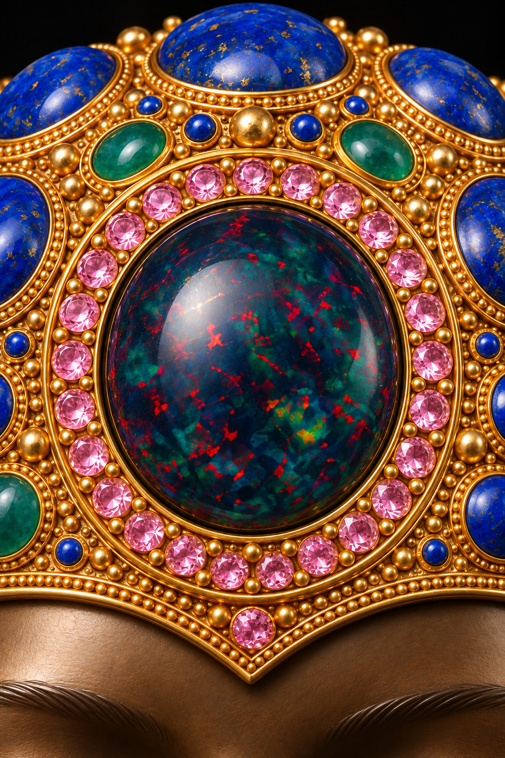
I am drawn to jewellery that rewards a closer look. The first impression might be the colour of a stone or the silhouette of an object. What holds my attention is the work around it: the edge of a setting, the rhythm of an engraved surface, the space between ornaments, and the way one material allows another to be seen.
When I developed The Sovereign Within, I wanted that kind of attention to shape the image. At its centre is a bronze-toned face with closed eyes. Around it, a crown and collar gather goldwork and coloured gemstones. I cared about the intricacy, but I also cared about the emotion. Every small detail needed to help sustain the quiet presence of the face.
Fabergé was an inspiration for that ambition. Buccellati, Cartier, Van Cleef & Arpels and Boucheron are houses I am now exploring as further reference points. Each gives me something particular to consider. Bringing them into this conversation helps me explain what I mean when I speak about craftsmanship, and what I want to carry into my own practice.
Fabergé: the imagination of an entire object
My interest in Fabergé begins with the relationship between richness and close attention. I want an artwork to invite the eye inward, offering another detail after the first has been noticed. A central stone can attract us, but the surrounding work determines how long we stay.
The historical firm also reminds me to look beyond a famous name. The Royal Collection Trust describes separate workshops led by workmasters, with about five hundred craftspeople employed at the firm’s height. It identifies hardstone carving, precious stones and transparent guilloché enamel over coloured gold among the specialities for which Fabergé was known.1 That account gives the objects a human scale: specialised hands and knowledge behind their finished appearance.
I admire the possibility of bringing those different kinds of expertise together. A carved form, a coloured surface and a gemstone each demand attention of their own. The finished object asks them to belong to one another. In my bust, the face, crown, earrings and collar need a similar sense of relationship, even though I am working in a different medium.
Fabergé helps me think about the object as a whole. I do not want a beautiful central stone surrounded by vague decoration. I want to be able to look at a small gold edge and feel that it has received consideration too. That is the standard of attention I took from this inspiration.
Buccellati: gold made expressive through surface
Buccellati draws me towards the surface of the metal itself. Its published account of craftsmanship describes rigato as closely spaced parallel engraving that produces a textile-like sheen. Telato uses crossing lines to suggest woven cloth. Tulle openwork creates a network of small openings, while lace techniques translate intricate patterns into pierced metal.2 These are different ways of organising light, texture and space.
What interests me is how much expression can come from the gold before a stone is considered. A polished plane, a fine line and an opening will each change what the eye sees. They can make an ornament appear softer, more delicate or more sharply defined. That is useful to me when I look again at the crown and collar of The Sovereign Within.
I spent considerable attention on the bronze finish because too much patterning disturbed the face. Looking towards Buccellati helps me articulate a distinction within my own design: a quiet surface can serve the expression, while a more intricate surface can serve the ornament. The amount of detail needs to follow the purpose of the area.
I also want the spaces between details to remain readable. Dense ornament becomes difficult to see when every gap disappears into the same brightness. My interest here is in the balance between richness and clarity. It makes me ask where a gold edge should catch the light, where a recess should deepen, and where the eye needs somewhere to rest.
Cartier: many disciplines serving one form
Cartier’s account of its high jewellery workshops names a range of specialists: stone experts, designers, sculptors, jewellers, three-dimensional designers, polishers, gem-setters and lapidaries.3 I find that breadth worth dwelling on. It gives a more concrete meaning to the idea of a jewellery house: the object develops through several kinds of judgement.
That coordination is what draws me to Cartier as a reference point. I want to think about how an overall form survives the attention given to its separate parts. The outline of a jewel has to remain coherent as stone, metal and finish are brought into relation. Looking at my own piece, I keep returning to the same practical question: does this detail strengthen the whole bust?
A stone can have convincing colour while its setting remains unclear. A crown can be elaborate while its placement distracts from the expression. Gold highlights can become so strong that the face loses its place in the composition. I want to notice those problems and make decisions about them, rather than assume that more detail will improve the image.
My work is digital, and I do not claim the physical skills of those workshop specialists. Their example gives me a way of examining what I represent. I can look separately at structure, material, setting and finish, then return to the complete image. For me, that repeated movement between the part and the whole is essential to refinement.
Van Cleef & Arpels: precision that allows a vision to emerge
Van Cleef & Arpels offers a particularly clear example of invention supported by exact work. The house’s Mystery Set technique, patented in 1933, places specially cut stones into a system of gold rails. The technique conceals the visible metal prongs that would otherwise interrupt the gemstone surface.4 It shows how a visual effect depends on a carefully resolved method of construction.
I am drawn to the patience behind that effect. When a jewel appears fluid or effortless, I want to understand the decisions that allow it to appear that way. The relationship between imagination and precision matters to me because emotion in an artwork also depends on small decisions that viewers may never identify individually.
In The Sovereign Within, the eyes are closed. The expression is restrained. A slight change in an eyelid, a highlight on the cheek or the boundary between bronze and gold can alter the feeling of the face. I want the detail to support that feeling without making the viewer conscious of every adjustment.
I am not representing the crown as an example of Mystery Set work. What I take from studying the technique is a question about purpose: what should the viewer notice, and what work makes that possible? For my image, the answer begins with the face. The intricacy around it should deepen our attention to its stillness.
Boucheron: curiosity about what a precious object can be
Boucheron interests me through its willingness to test materials against an imaginative idea. In its account of the Carte Blanche collections, the house describes Fleurs Éternelles, using stabilised flower petals and titanium structures shaped from individual scans. It also describes Ailleurs, bringing diamonds into conversation with materials such as pebbles and burnt wood, and gold with rattan.5 Those examples broaden the material conversation around jewellery.
I find that openness useful. It encourages me to ask what a material can contribute to an image beyond its expected prestige. Colour, weight, texture, fragility and association can all become part of the work. A material choice becomes more interesting when I can explain why it belongs there.
My own gemstone palette was chosen with meaning in mind. Lapis lazuli carries wisdom and depth in my reading; emerald brings renewal; dark opal suggests an inner complexity that takes time to see. Pink sapphire brings tenderness, and ruby adds vitality. Those associations belong to this artwork. They help me make decisions about the relationship between colour and emotional presence.
Boucheron gives me a reference for carrying curiosity forward. I want to retain the care I admire in traditional craftsmanship while remaining willing to reconsider a surface, a combination or a tool. The test is what the choice does for the work. An unexpected material needs a reason to be there, just as a familiar gemstone does.
The makers behind the names
As I look at these houses, I want to keep the craftspeople in view. A recognised name can help us find an object, but it does not tell us everything about how that object came into being. The engraver, carver, setter and polisher each bring knowledge that deserves attention.
This is part of what I mean by the standard of a master jeweller or a Renaissance craftsman. I am speaking about an approach I aspire to: taking the smallest decision seriously, understanding its relationship to the whole, and continuing to look when the first impression is already pleasing.
There are limits to what I can infer from a finished image. I cannot assess the strength of a joint or the security of a setting from its appearance alone. In my digital practice, I can consider whether those relationships are visually convincing, while recognising that physical craftsmanship also involves demands my image does not demonstrate.
Returning to the face
The Sovereign Within is an artist-directed, AI-assisted digital artwork. Its bronze, gold and gemstones are simulated. My reference to jewellery craftsmanship describes the inspiration and judgement behind the image; it does not mean that I cast the bust, engraved gold or set physical stones.
The four macro studies let me share where I placed that attention: the crown’s central stone and surround, the closed eyes and bronze finish, the emerald earring, and the collar’s concentrated ornament. They are generated interpretations of the selected frontal master, with some details changing at close range. I want them to encourage a slower look, followed by a return to the full composition.
What I hope to learn from these houses is how care becomes visible. Fabergé belongs to the inspiration for this piece. The other houses are reference points I am exploring as I develop my understanding of surface, structure, precision and material invention.
For all the jewellery surrounding it, I still judge the work by the face. I want the crown to draw us close enough to notice the eyes. I want the colour to lead us towards the stillness. The details have done their work when the person at the centre continues to hold our attention.